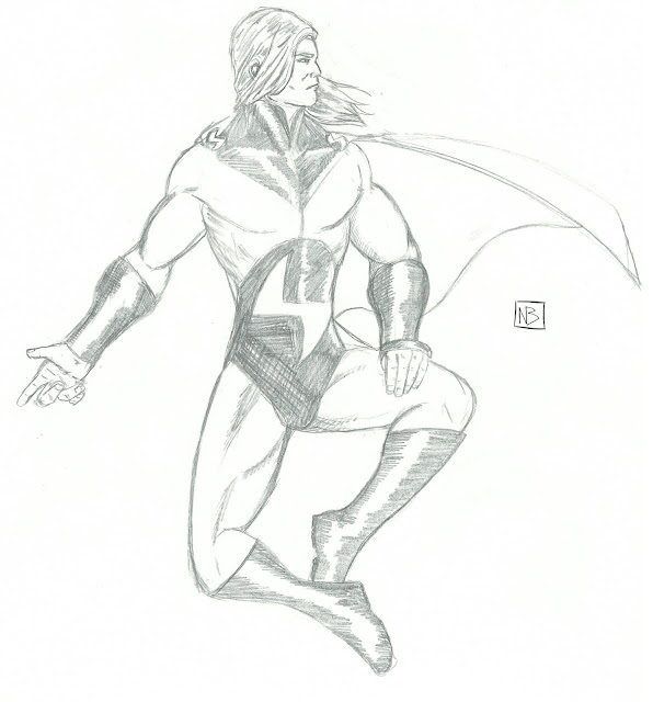
So, what could I whip up on short notice? A little something I call: Then and Now.
Basically, I'm going to dig up an old drawing of mine and re-draw it, just to see how far I've come. See? It's like a metaphor for all the people reading my blog, if you don't think about it too much.
And with that, I'm going to redraw a picture I did of Marvel's Superman parody/homage/pastiche, the Sentry.
 |
| Drawn in 2007. |
Let's see, where do I begin?
As the artist of this piece, I can tell you what was going through my mind when I drew it. Basically, being a teenage boy who grew up in the 90's, I thought that the scowl and the muscles and the clenched hands made him all dark and edgy. Now, the lack of anatomical accuracy is because I didn't know how the human body went together. If the finished product looks like a 14-year-old's interpretation of the Sentry inspired by the artwork of Michael Turner and Rob Liefeld, that's only because it is.
To be honest, I'm in awe of this drawing, because it actually displays a skill I seem to have lost over time. That skill is making a character both over-muscled and super-skinny at the same time. How the heck did I accomplish that?
This drawing is in desperate need of a reboot. Here's one I prepared earlier!
Better. You'll notice the anatomy is less screwed-up immediately, with the inclusion of a crotch this time around. I wanted to replicate the original pose, but then I decided that
A. The original pose was stupid
and
B. You'd have to be flexing pretty dang hard to make your muscles pop that much. He looked constipated, if anything.
I added a shine to the black parts to differentiate the texture, and I toned down the definition on the muscles while bulking him up. It's also interesting to note that while in high school I actively tried to emulate Michael Turner, with this drawing it seems that I'm unconsciously taking inspiration from Frank Quitely.
Nifty.
Thanks again for getting me to 1000 hits, and here's hoping for 1000 more!


No comments:
Post a Comment